
Vosem - Packaging Design
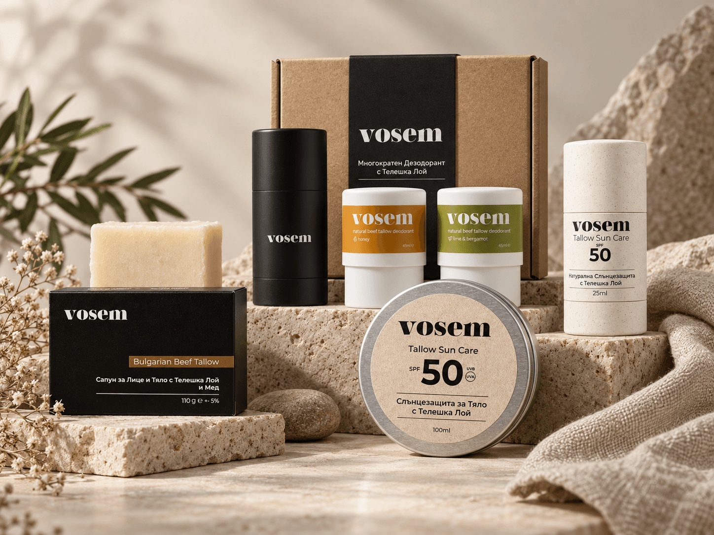
Vosem is a Bulgarian skincare brand creating tallow-based products using beef tallow sourced from a local farm, alongside carefully selected natural and organic ingredients. We developed a cohesive packaging system across several of the brand’s product lines, creating a recognisable visual language that brings the range together while allowing each product to retain its own identity.
The Challenge
Vosem’s range spans different product categories, formats and packaging structures - from bar soaps and sun care to a refillable deodorant system.
The challenge was to create a design language flexible enough to work across all of them while making every product feel unmistakably part of the same brand.

Our Approach
We built the system around minimal compositions, a clear typographic hierarchy and a restrained colour palette.
Black and warm neutral tones form the visual foundation, while carefully selected accent colours help differentiate individual products, variants and key ingredients.
Information is structured to make the essentials immediately clear: the brand, product type, key ingredient and purpose.
The result is a flexible visual system that translates consistently across different materials, shapes and sizes, while leaving room for the product range to expand over time.
What We Designed
Beef Tallow Face & Body Soap
A series of product variants unified by a black base, minimal typography and individual colour accents inspired by their ingredients and formulations.
Natural Beef Tallow Body Sunscreen SPF50
A clean, understated packaging direction built around light, natural tones that complement the product’s mineral and nature-led positioning.
Natural Beef Tallow Face Sun Stick SPF50
A compact adaptation of the wider packaging system, designed to maintain the same visual hierarchy within a significantly smaller format.
Beef Tallow Deodorant - Refillable Case & Refills
A packaging solution created for a refillable product system, with a consistent identity across both the reusable case and its replacement refills.


The Outcome
The final system gives Vosem a cohesive packaging language that connects products across multiple categories into one recognisable family.
Minimal layouts, confident typography and a natural colour palette allow each product to stand on its own while remaining visually connected to the wider range - whether seen on a shelf, in an online store or as part of a campaign.
Does your product deserve packaging that stands out?
Let’s create a distinctive visual system that presents your brand consistently - from a single product to an entire range.
Let’s discuss your project